Now You See It
0
0
As an Amazon Associate and affiliate partner, Menrva Books earns from qualifying purchases. Learn more
Author Description
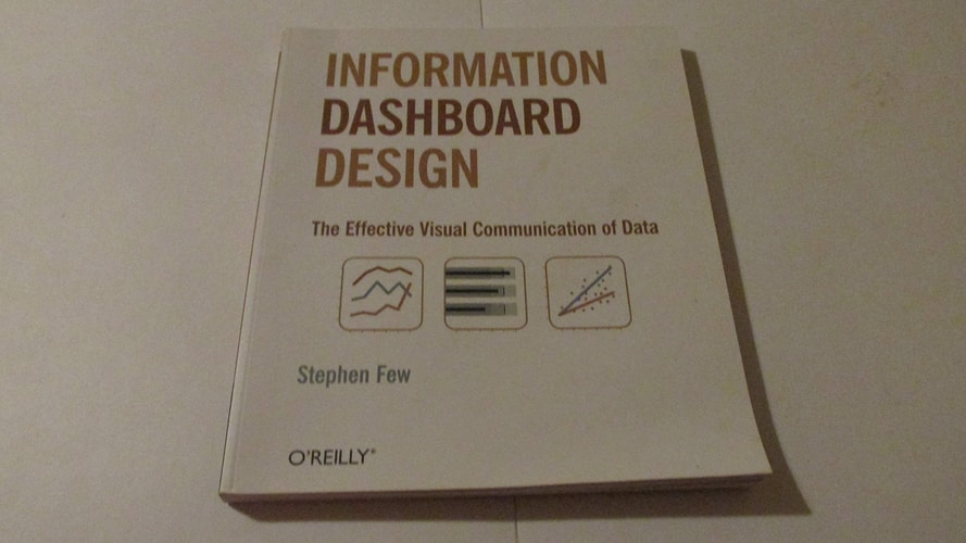
This book is about the fundamental problem of data visualization: the fact that we have too much data and not enough clarity. It argues that effective data visualization is crucial for accurate understanding and decision-making. The book provides practical guidance on how to create effective data visualizations and dashboards, and how to avoid common mistakes. It is intended for anyone who works with data and needs to communicate it effectively.
Menrva's Summary
THE THESIS
The core problem in data analysis is not a lack of data, but a lack of clarity in its presentation. Stephen Few, a recognized expert in information design, addresses this fundamental issue by arguing that effective data visualization is crucial for accurate understanding and decision-making. He posits that many analytical efforts fail not due to flawed data or methods, but because the visual representations used are misleading or ineffective, obscuring rather than revealing insights.
THE SCOPE MAP
- Principles of effective data visualization and dashboard design.
- Identification and critique of common visualization mistakes.
- Guidance on choosing appropriate chart types for different data.
- Strategies for designing dashboards that clearly communicate key metrics.
THE AUTHORITY PERSPECTIVE
Stephen Few's work is highly regarded in the fields of data visualization and business intelligence. His practical approach and clear explanations are often cited by professionals seeking to improve their data presentation skills. The book is frequently recommended for its actionable advice on creating dashboards that are both informative and easy to understand, helping to bridge the gap between raw data and meaningful insights.
Page Count:
327
Publication Date:
2009-01-01
ISBN-10:
0970601980
ISBN-13:
9780970601988
Non-Fiction
Business
Information Design
Community Tags
Similar Books